|
Every designer can have an affection for various aspects of art, whether it be color, letterforms, textures, or any other favorite deemed worthy. At Sevenelle, we've always carried a soft spot for typography and characters, especially ampersands. We're sharing a few of our favorites found across the web in identities to swoon over. What are your favorite parts to a design? Let us know in the comments! 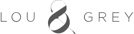 Lou & Grey Best known for dressing the working free spirit, this clothing label doesn't stray from its true identity with a logotype that carries the same aesthetic of their creations: simple, classic, and comfortable. See more at louandgrey.com.  Olive & June With locations in Beverly Hills, Pasadena, and Santa Monica, California, it's no wonder why this nail salon is quickly becoming a neighborhood favorite. The attention to detail and treatment of their guests is top-knotch, alongside their minimalistic logo, complete with even a touch of the signature Olive & June pink. See their locations and schedule an appointment here. 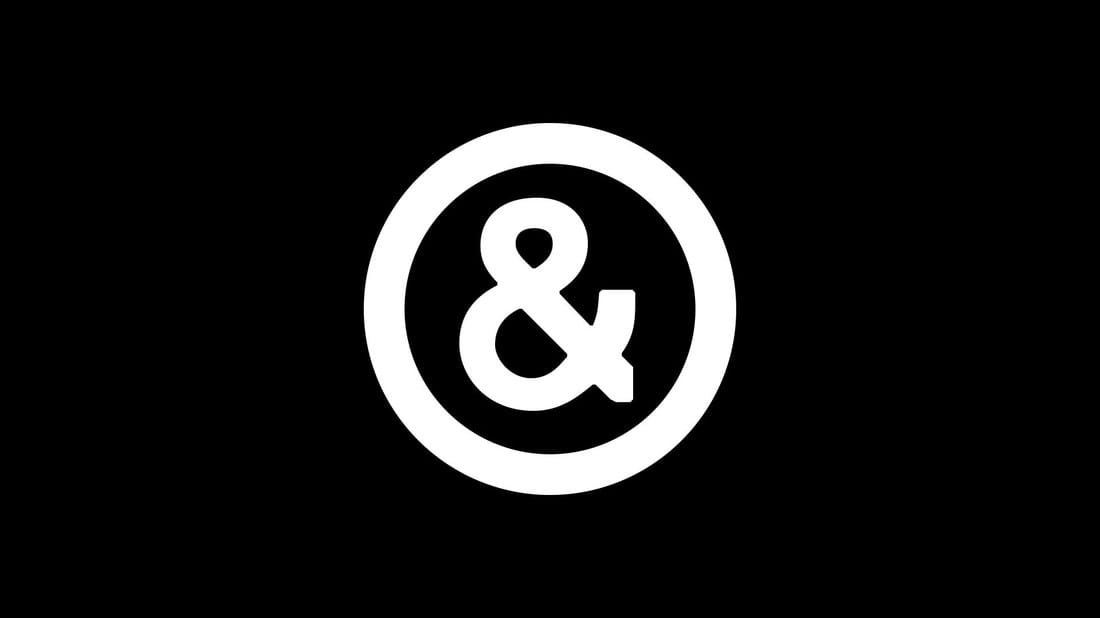 Sagmeister & Walsh This minimalistic identity of the badass, advertising duo, Stefan Sagmeister and Jessica Walsh is bold, simple, and right to the point. The mark perfectly captures the essence of the dynamic genius behind the industry-leading New York-based office. 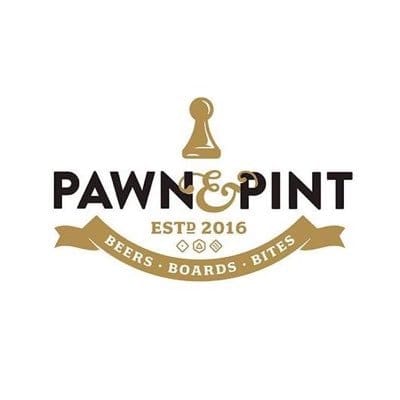 Pawn & Pint From what began as a Kickstarter campaign, Pawn & Pint brings food, boardgames, and brews to the Crossroads district. The ampersand hugs the "N" and "P" as an visual invitation to bring friends and family to enjoy some cold ones and indulge in some classic games such as chess, Scrabble, Dungeons and Dragons, and more. Check out their Facebook page for more information. 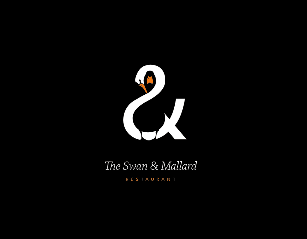 The Swan & Mallard As part of the Behance portfolio for London-based designer John Randall, this identity is a playful take on the use of positive and negative space to illustrate both fowl. Shown across collateral, the logo is placed onto menus, signage, promotional business cards, and more. See the full project here. READ MORE ON THE BLOG
1 Comment
|
SEVENELLE
|

 RSS Feed
